Why a Room Changes the Scale of an Artwork
Room scale changes how an artwork reads: assess viewing distance, sightlines and visual noise before choosing where to display it.
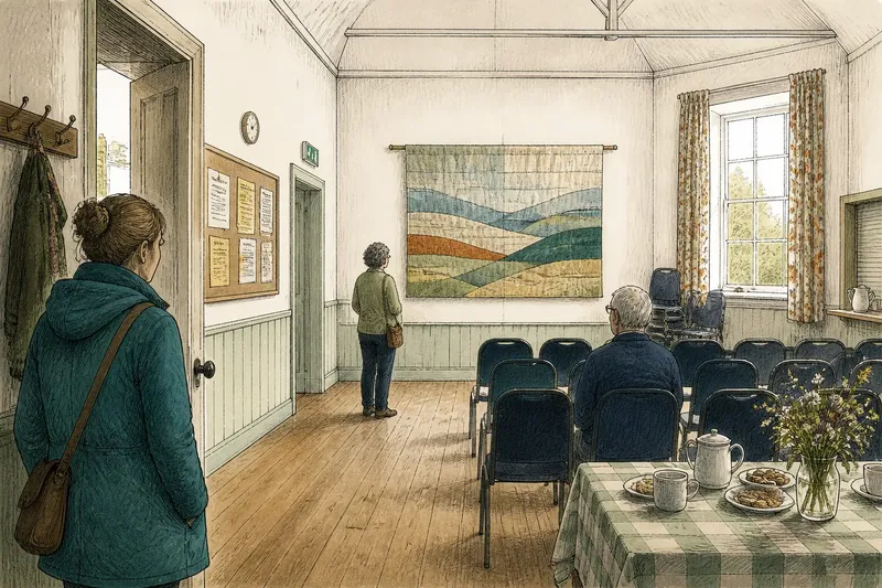
How will the same artwork read in a room with a different viewing distance, sightline or amount of visual clutter? Room scale is not simply a matter of wall size: it is the relationship between the work, the places people stand and everything else competing for attention. A modest drawing can hold a broad wall if viewers can approach it; a large piece can feel oddly slight when a doorway, bright window or patterned curtains divide the view.
Distance sets the first reading
People rarely look from one fixed spot. In a rural gallery, village room or converted schoolhouse, someone may first see a work from the entrance, then come closer, then step aside to let another visitor pass. Those changes in distance alter what is legible: an overall shape may register across the room while small marks appear only at close range.
Before choosing a wall, stand where a visitor is likely to enter and note what can be seen without stopping. Then look from the nearest comfortable viewing position. If the work’s main idea depends on delicate detail, a display spot that forces everyone to remain across a broad room may flatten it. If it depends on a strong silhouette or large blocks of colour, the long view may do useful work.
Consider the ordinary furniture as part of this viewing distance. A table used for tea, a line of chairs or a stack of folding screens can push people back, even when the room is technically open. The relevant question is not how much floor area appears empty, but where a person can actually pause without obstructing a route or being asked to move.
Check the sightline from the door and the chair
A work may have a clear wall and still be hard to see. Door frames, coat hooks, a low beam or the edge of a noticeboard can cut across it from the approach. In rooms used for several purposes, a display also shares attention with practical objects: a clock, a fire exit sign, a serving hatch or the day’s handwritten notices.
Walk the likely route through the room and look at the proposed spot from more than one angle. Notice what overlaps the work and what draws the eye first. A slight shift along the wall may clear a door frame; moving the work to another wall may instead put it in direct competition with a bright window. The useful location is the one that makes the intended view possible, not merely the one with the neatest patch of plaster.
Think about seated viewers as well as people standing. A work placed above the usual eye line may be visible from the doorway but disappear behind the heads of people at a meeting. In a room with mixed uses, look from the chairs that are normally brought out, rather than imagining a gallery with all the furniture removed.
Visual noise changes apparent size
A busy wall can make a work seem smaller because its edges have to compete with nearby frames, shelves, patterned curtains or a strong dado rail. A bare wall can have the opposite effect, giving a small piece more room to register. Neither condition is automatically better. The issue is whether the surroundings support the kind of attention the work asks for.
Look at the wall as a whole before deciding. If a work has fine marks or a quiet tonal range, a neighbouring poster with bold lettering may pull attention away. If the room contains many objects that cannot be moved, a simpler wall may provide a clearer view. For a group display, consistent spacing can help visitors read separate works as deliberate neighbours rather than as one crowded patch.
Do not try to make every room neutral. A village hall with a noticeboard and a row of stacked chairs is still the room it is; erasing all signs of use can be more effort than the display deserves. Instead, identify the strongest distractions and decide which can be shifted, covered or left alone. A useful edit is often selective, not immaculate.
Use a temporary outline before settling on a wall
When the final position is uncertain, mark the proposed footprint with removable paper or low-tack masking tape, if the surface allows it. Include the space needed around the work, not just its outer edge. Then view the outline from the entrance, from the main seating area and from the closest point where a visitor could comfortably stop.
Say a small group plans to display a broad textile in a former classroom, where the main wall faces rows of chairs and a bright window sits nearby. They mark the textile’s full outline on a quieter side wall, then check it from the doorway and from the chairs. The expected result is a clearer view of its overall form, with fewer interruptions from furniture and window glare; if the outline still vanishes behind the room’s traffic, they can reconsider before hanging anything.
Temporary marks are a viewing aid, not a substitute for suitable fixings. For hanging methods, wall types and any restrictions on the venue, follow the relevant instructions and ask the venue manager or a qualified installer where needed.
How should you judge a display space?
How far away will visitors first see the work?
Check the entrance and the route people naturally take, then compare that long view with a closer one. This helps reveal whether the work’s main visual feature reads before its finer details.
What might interrupt the sightline?
Look for door edges, furniture, signs, beams and the heads of seated visitors. A clear wall on its own does not tell you whether the work remains visible in use.
Should a work sit beside other objects?
Place it near neighbours only if their scale, spacing or subject helps the display make sense. If a bright notice or patterned surface dominates the same view, try a different position or reduce the nearby clutter that can be moved.
What if the room has no ideal wall?
Choose the position with the clearest useful view and adjust the display to the room’s real traffic and furniture. A compromise that lets people pause and look is generally more effective than a formally centred position nobody can approach.
Let the room decide what kind of attention is possible
Room scale is best judged as a sequence of views: the first glimpse, the pause and the closer look. Before choosing a display space, check those views against the work’s most important visual feature, the room’s ordinary use and the distractions that cannot sensibly be removed. That is usually enough to make a sound choice without turning a modest hanging into a survey of every wall in the building.
For a final check, visit the room at the time it will be occupied if that is practical. Daylight, open doors and furniture in use can change the view more than a tidy, empty room suggests. Room scale is not a fixed property of the artwork; it is the attention the actual room allows it to hold.