The Local Colour Palette Myth: Place Is Not a Paint Chart
A local colour palette need not copy familiar scenery. Choose colours by what the work needs to say, and make place present without postcard shorthand.
What should a local colour palette do if the work is about a place but not a picture of its scenery? It should serve the work’s purpose, not prove that its maker has noticed the hills, hedges or harbour. A place can be present through the choices a piece makes, including colours that refuse the expected view.
A local colour palette is not a loyalty test
When an artist is asked to make work about a rural place, the obvious colours tend to arrive first: green for fields, blue for water, brown for soil, perhaps grey for a dependable sky. These colours may be accurate. They may also be doing little beyond announcing the subject.
The trouble is not using local colours. It is treating them as a compulsory scenic inventory. A palette can reduce a complicated place to its most recognisable surface, as though every village had agreed to sit for the same postcard. People who live there encounter more than views: work, weather, memory, maintenance, change, routine and argument all belong to the place too.
Colour becomes more useful when it has a job. It might direct attention, carry a mood, separate one voice from another or make a familiar detail feel newly visible. The place then informs the work without dictating a paint chart.
Scenic colour suits work that wants recognition
One approach is to use colours associated with the local landscape or built environment. This can suit a work intended to be quickly legible, especially when its purpose is to evoke a setting, welcome an audience into a shared reference or make a visual connection with a particular site.
That approach does not require copying a view literally. A maker might draw on the rust of a gate, the pale stone of a lane or the dark green of a shelterbelt, then simplify those colours into a restrained palette. The useful question is whether each choice contributes to the work, rather than merely confirming its postcode.
There is a risk of turning recognition into shorthand. A green-and-brown palette may say “countryside” at a glance, yet tell the viewer little about this countryside or the work’s particular concern. If the piece addresses a changing local trade, an empty meeting room or the daily care of a shared place, scenic colours might establish the setting while leaving the actual subject untouched.
This option suits work where immediate place-recognition matters. It is less useful when the work needs to unsettle a familiar image or attend to aspects of local life that do not make picturesque company.
Purpose-led colour suits work with a specific point to make
A second approach is to choose colours by function. Start with the experience the work should create: calm, friction, closeness, distance, clarity or some less tidy mixture. Then consider which colours can support that experience and which would distract from it.
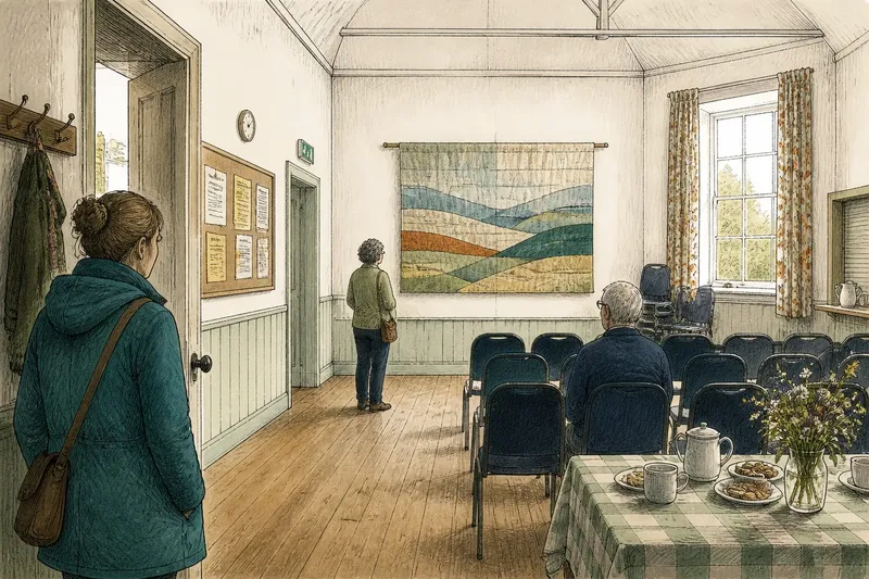
Purpose-led colour does not mean ignoring local knowledge. It means asking what that knowledge contributes. A maker might use the colour of a noticeboard, a community hall curtain or a faded shop sign because the work concerns public memory or shared attention. Those details are not scenery in miniature; they are evidence of how people use and recognise a place.
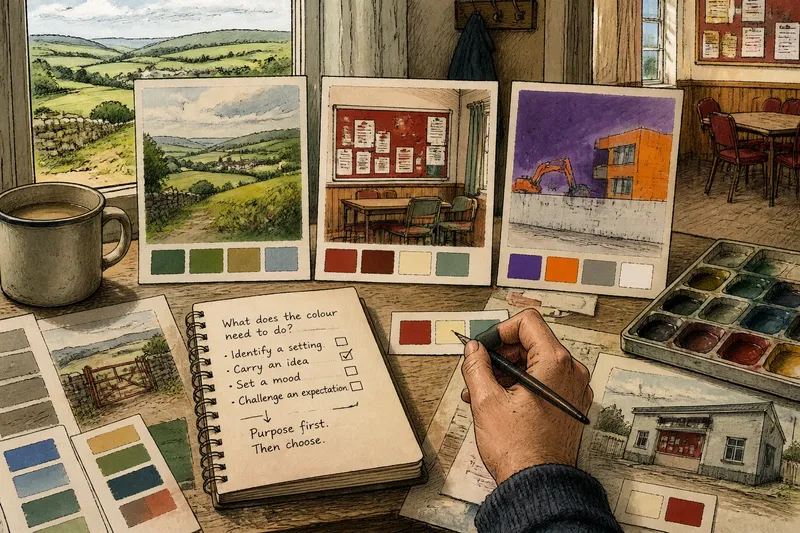
Say a maker is preparing a small poster about the closure of a village meeting room. They could use the familiar greens of nearby fields, which would anchor the poster in a rural setting. Or they could choose the worn red of the room’s noticeboard and a quiet cream drawn from its paper notices, making the focus the local space where information and decisions once gathered. The second choice is not more truthful by default; it is more closely aligned if the poster is about shared use rather than landscape.
This approach suits work with a clear subject, a particular audience or a deliberate emotional tone. It can also help a maker avoid decorative local references that compete with the work’s actual point.
Deliberate contrast suits work that questions the expected view
A third approach is to choose colours that sit against the usual local image. A sharp violet, an artificial-looking orange or a cool white might interrupt the expectation of soft greens and earth tones. Contrast can make a familiar subject harder to skim past.
This is not a licence to be contrary for its own sake. A surprising colour still needs a reason. It might distinguish a current voice from an inherited picture, expose a tension between land and development, or draw attention to something usually treated as background. Without that purpose, surprise can become another kind of decoration, only louder.
Contrast suits work that wants to question how a place is represented, or to make an audience reconsider what it assumes belongs there. It may be less suitable when the work depends on quiet continuity or when visual disruption would obscure its central message.
Which palette serves the work best?
Should every colour come from the local landscape?
No. Landscape colours are useful when they contribute to the work’s meaning or make its setting legible. They need not be included simply to certify that the subject is local.
Can an invented palette still feel specific to a place?
Yes, if the choices connect to the work’s subject, audience or local references rather than to a generic idea of rural life. Specificity can come from what a colour points towards, not only from where it was seen.
When is contrast worth using?
Use it when the work benefits from interruption, disagreement or a changed point of view. If the unusual colour has no purpose beyond catching the eye, it may be noise with excellent timing.
How can a maker choose between these approaches?
Write down what the colour needs to do: identify a setting, carry an idea, set a mood or challenge an expectation. Choose the approach that supports that task, then remove any colour that has no clear contribution.
A simple decision begins with the work’s purpose
Before selecting paint, ink or digital swatches, describe the work’s intended effect in plain language. “Show the fields” is a subject; “make the audience notice how the fields are changing” is closer to a purpose. That distinction can change the palette before any material is opened.
Then look for local references that serve that purpose. These might be familiar landscape colours, the objects people encounter in shared spaces, or a contrast that unsettles a fixed image of the area. A short palette is often easier to read than one that tries to include every local association. What is not worth the effort is collecting colours from every landmark simply to demonstrate thoroughness. The paintbox is not a parish register.
If the work is collaborative, ask participants what colours they associate with its subject, not only with the place as a whole. Their answers may expose differences worth retaining rather than smoothing into a single official palette. Keep the conversation tied to the work: colour choices should support its purpose, not settle who owns the most authentic view.
A local colour palette can borrow from scenery, but it does not owe scenery an appearance fee. Choose what helps the work speak clearly, whether that is recognition, a specific local reference or deliberate contrast. Place is more than its visible colours, and art has room to make that plain.